Key points:
- Google Messages revamps how you share content: choose recipients with a clearer interface.
- New fullscreen UI lets you search recent conversations and access your entire contact list.
- Improved context with message snippets helps you pick the perfect recipient.
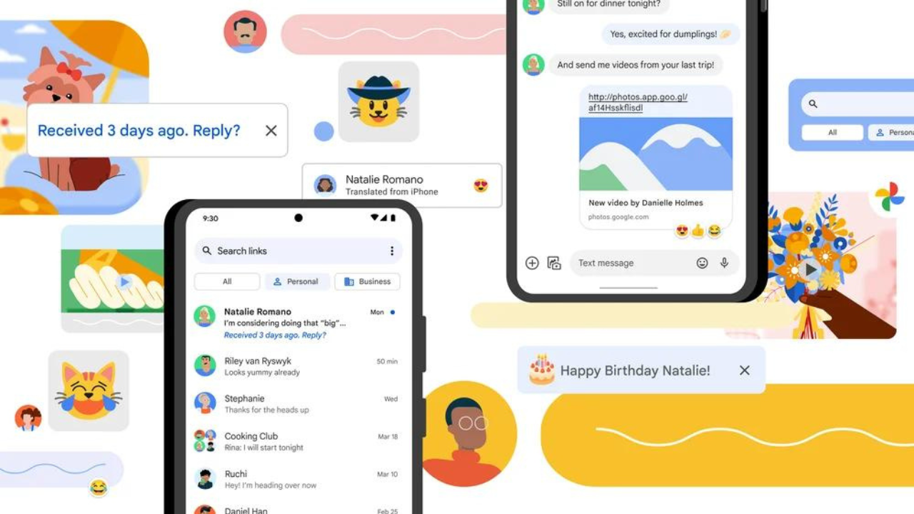
Google Messages is streamlining the way you share content on Android. After an initial testing phase last October, a redesigned sharing interface is rolling out more widely. This update promises a smoother and more informative experience when selecting recipients for your messages.
Gone is the old pop-up menu. Instead, you’ll be presented with a full-screen “Select recipients” UI. This new layout prioritizes clarity and ease of use. Front and center are your five most recent conversations, complete with a snippet of the last message sent. This context helps you quickly identify the right conversation thread to share with. Need to dig deeper? Simply tap “More recent conversations” to access your entire message history.
The update also integrates a search bar in the top-right corner, allowing you to find specific contacts or conversations with ease. Gone is the dedicated “New message” shortcut, replaced by your full contact list. This simplifies the process of initiating a new conversation to share content if needed.
Multi-tasking is a breeze with the new UI. You can select multiple conversations by tapping on their profile avatars, which will then appear in a dedicated row at the top. Once you’ve chosen your recipients, simply tap the “Next” button and “Share individually” to complete the process.
This redesigned sharing interface isn’t limited to just the share sheet. It also appears when forwarding messages within the app and when sharing photos directly from the home screen camera shortcut. While the new layout might seem busier at first glance, the additional information and search functionality provide a significant improvement in usability.
The rollout appears to be staged, with more users reporting access in recent weeks. While not quite ubiquitous yet, the wider availability suggests Google might be nearing a full launch of this share redesign. For now, you might encounter it in the beta channel, but keep an eye out for it to hit your device soon.

Leave a Reply