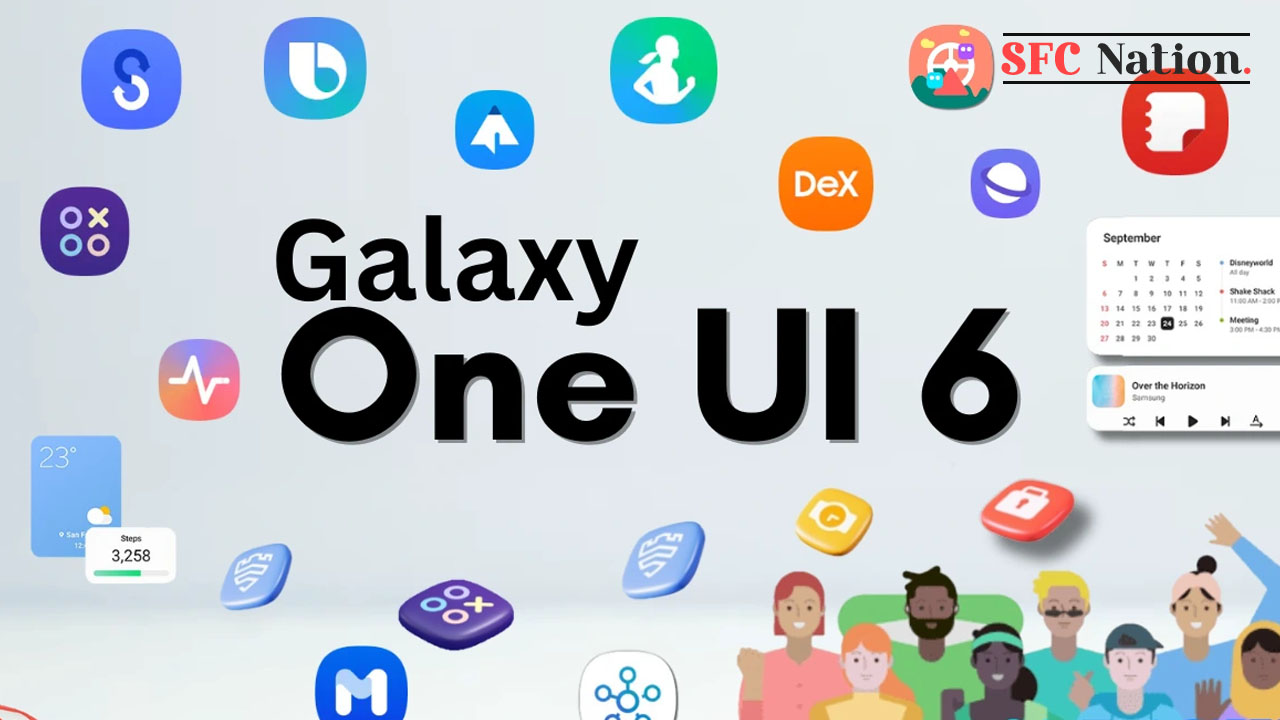
Samsung One UI 6 brought lots of new features and optimization such as a revamped layout for notifications, to offer users a more organized and user-friendly experience. The new design aims to provide users with quick and relevant information.
As per the details, the One UI 6 enhanced notifications layout features a clean and modern design, adopting a more minimalist approach. Each notification now appears as a separate card, making it easier to recognize individual notifications.
Notification icons now look the same as the app icons that appear on your Home and App screens, making it easier to recognize which app sent the notification.
The new design prioritizes important information and provides customization options, allowing users to manage their notifications more effectively.


Leave a Reply