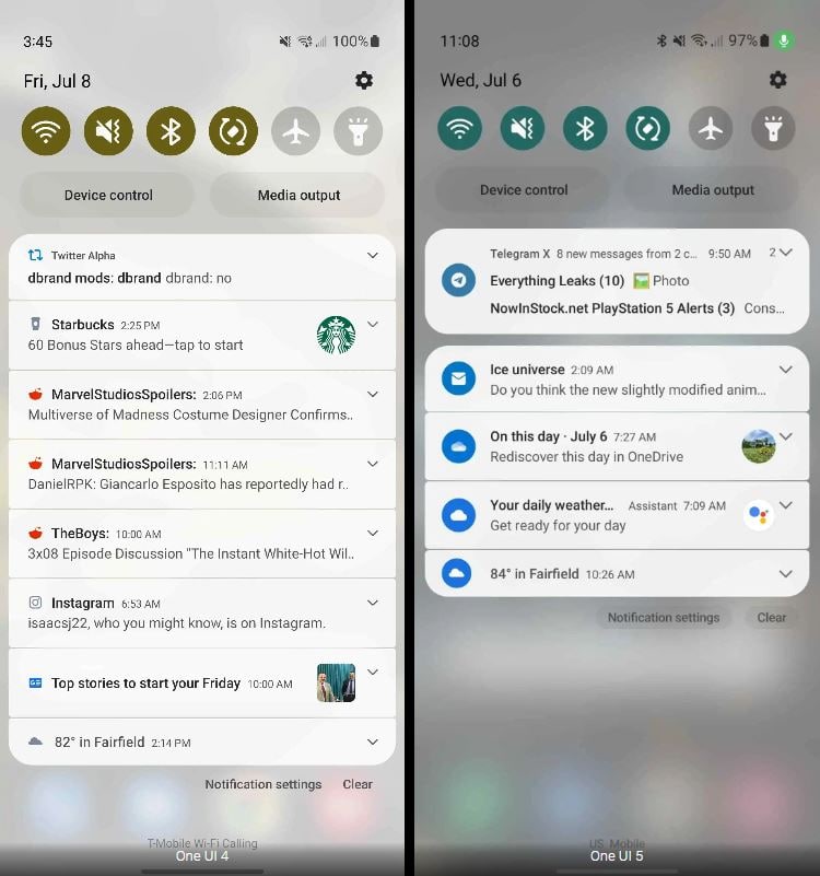
According to the new information, Android 13-based Samsung One UI 5.0 beta includes a new Notification panel design. 9to5Google indicates that the upcoming Samsung One UI 5.0/Android 13 beta notification panel will have subtle changes in design as compared to the One UI 4.1 and 4.0.
Stay tuned via SFCNation Telegram
With this new UI, Samsung has tried to present a clear look and feel while keeping a separate space for different groups of apps or priority ones. The app icons have received minor optimizations such as a new solid round background shape.
Notably, there are not seem any majorchanges but we can say that Samsung has really worked to bring us a clearer and more effective notification panel on One UI 5.0/Android 13.

Moreover, the Notification Panel helps you to get an insight into all of your current system and third-party app notification right from your home screen. You just need to access it by swiping down from the top of the screen and scrolling it further to expand all of the available options.
With the revolution in One UI software, Samsung has continuously made improvements to this feature. On the other side, the South Korean tech maker continues to make it useful for Samsung smartphone users.
One thing to note is that the current findings about the upcoming One UI version have been found under the Samsung One UI 5.0/Android 13 beta program and there might be some changes that may appear on the later version of the test build but there are only a few changes of that happening.


Leave a Reply