Recently, we got access to the official press renders of Galaxy S23 smartphones which do not show any major changes in the design of the Ultra model. But if we have a closer look at the smartphone then we will observe some changes which show the glory of Galaxy S23 Ultra.
Join SFC Nation On Telegram
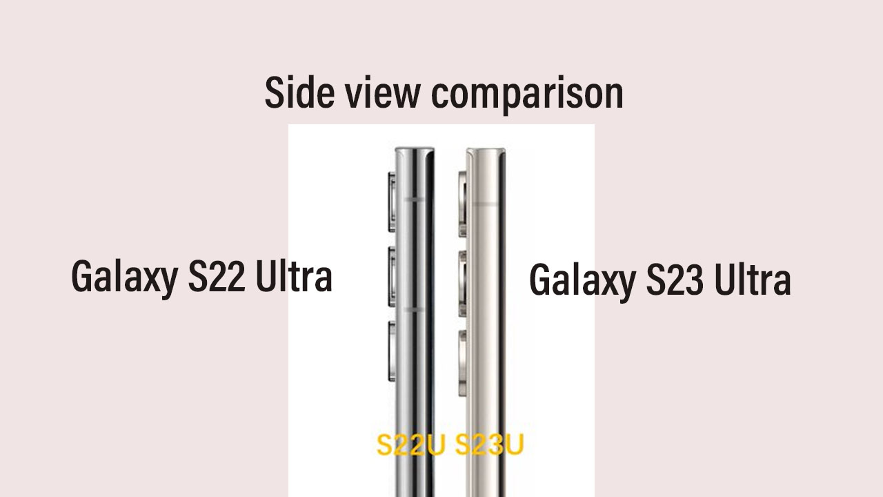
In a recent development, a well-known tipster IceUniverse has compared the side view of the Galaxy S23 Ultra with the Galaxy S22 Ultra, and the comparison really shows some noticeable upgrades in the camera, middle frame, side buttons, and more.
Join SFC Nation On Google News
According to the tipster, the middle frame of the Galaxy S23 Ultra is widened than the Galaxy S22 Ultra, further, the buttons are moved down and it also gets enlarged. Additionally, the three cameras on the left are larger and seem to be a little thicker as we heard earlier.

Furthermore, the two protrusions on the right are significantly reduced to provide more better gripping and comfort for the users, the comparison is been done by placing both device side by side and it clearly shows the glory of Galaxy S23 Ultra.
Not only this but the same tipster also points out the Galaxy S23 Ultra includes a middle frame, left and right 2.2mm, top 2.7mm, chin 3.6mm, and hole 3.7mm which are overall similar to Galaxy S22 Ultra.
S23 Ultra S22 Ultra side view comparison
It can be seen that the middle frame is widened
The button is moved down and widened
The three cameras on the left are larger and seem to be a little thicker
The two protrusions on the right are significantly reduced pic.twitter.com/vYZLRJg4D2— Ice universe (@UniverseIce) January 14, 2023


Leave a Reply