Chrome is one of the most used applications and Google keeps on optimizing its functionalities and interface to offer users a seamless experience and the same is the case with the latest update. In a recent development, Google is redesigning the Chrome app with more Material You elements.
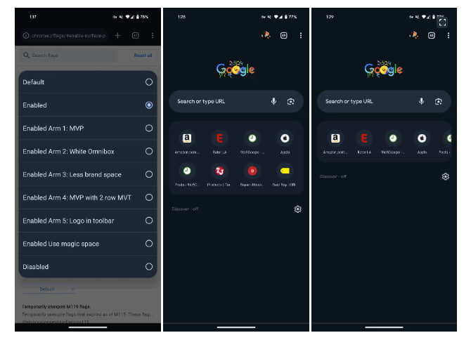
According to the details, the latest modification makes Google Chrome’s new tab page search bar thicker on Android. While, the text inside the search bar is bolder and gets more color, while the same is replicated for the microphone and Lens icons, which offers a more apparent look.
Moving on, the discover and following switches on the Google Chrome new tab page are now placed inside rounded squares, the Google logo above the search bar becomes smaller but looks much whiter, and the grid of the frequently visited websites is now placed inside a rounded square card.
To be mentioned, the new elements of Google Chrome Material You design for the new tab page are rolling out, but if you haven’t received the change even after installing the latest update, then you get it by turning on the flag.


Leave a Reply