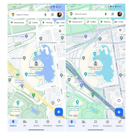
Google Maps has started rolling out the new color palette widely to users across the globe. This update brings a fresh and vibrant look to the popular mapping platform, enhancing the overall user experience and making it easier to explore the world.
According to the details, the lighter shade of green is used for parks and nature which results in a nice contrast with roads, and goes from off-white to gray. Whereas, the buildings and structures are still gray or light yellow, depending on their prominence.
Moving on, the freeways got much darker gray, with some blue undertones, for a nice thematic consistency with roads. In addition, the restaurants are shown as orange pins. Overall, the changes are quite noticeable and contribute to Google Maps feeling more lively.


Leave a Reply