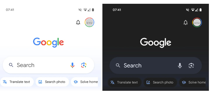
Google is constantly improving its application with some or other tweaks to provide users with a seamless experience. The latest update to the Google App on Android includes some notable tweaks that aim to enhance the functionality and appearance of the homepage.
According to the information, the Google app homepage has gone through various changes and one among them is the subtle blue gradient that helps make the app feel less stark. The search bar which appears at the top of the screen has also become bigger to provide a more clear glance.
In addition to the bigger search bar, Google has also added a magnifying glass icon to the left next to search. Last but not least, in the dark mode of the application, the microphone and Google Lens icon are now white instead of multicolored.
However, the new layout provides a more organized and visually appealing interface. Accordingly, these changes are currently live for some beta users and will be expanded to a wider audience in the future.


Leave a Reply