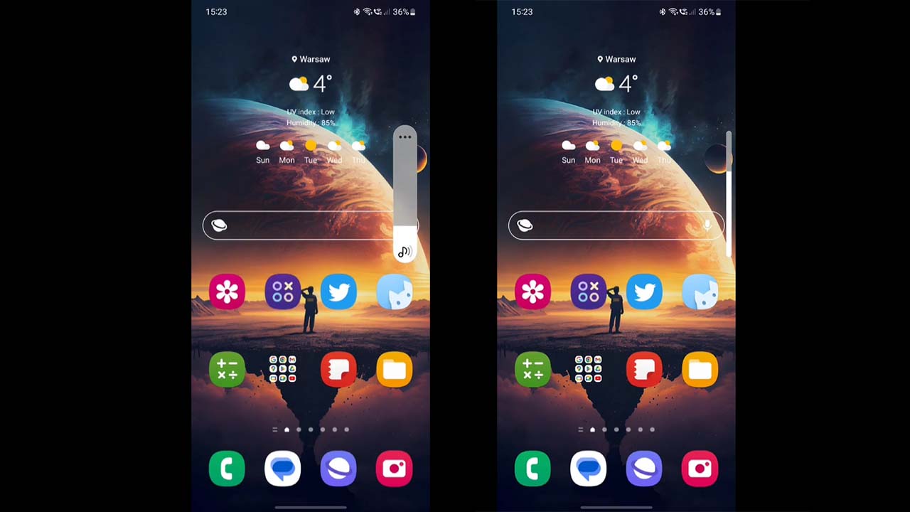
No doubt that Samsung has a great user interface. But still, there are some compartments that need improvements, such as its volume panel. Recently, we get to see a volume panel concept for One UI software, which Samsung should watch and consider revamping the outdated interface.
A young concept creator named V3trox360 recently shared a volume bar concept that is inspired by Apple’s iOS. At present, the primary volume slider is quite thick and has no additional eye-catching stuff other than that. The concept showcases an iOS-like volume bar, which gets slimmer when you adjust the volume level.

One UI can take inspiration from iOS and bring a better variant of the volume slider as it’s one of the most used parts of the user interface. A slimmer slider will greatly increase the visibility on the display by occupying less area on the display and the animation changes will make it more intuitive.
As it’s just a concept based on the user’s imagination, it shouldn’t be appropriate to commit to the official. Meanwhile, we can hope that the next major One UI upgrade will make changes to the user interface elements such as the notification panel, quick settings, and volume bar.
One UI unobtrusive volume slider Concept. When you use the volume buttons the full slider will appear, and when you continue pressing them it will get slimmer to hide less content, as soon as you use your finger to adjust the volume it will get bigger again. pic.twitter.com/ajaIIwZbOh
— V3trox360 (@Vetrox360) February 26, 2023


Leave a Reply