Samsung introduced the new One UI 5.0 iteration based on Android 13 for the Galaxy S22 and Galaxy S21 series flagships through a beta program. The new software version comes with many new features and functional improvements to provide you a better user experience.
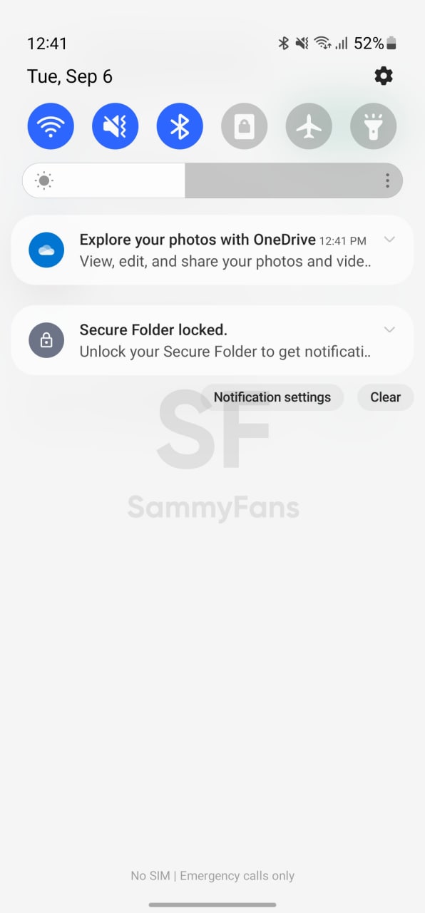
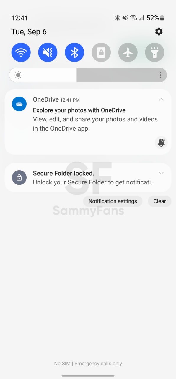
Talking about the Notification panel, there has been no major change in the design and style with the new One UI 5.0. Compared to the previous One UI 4.1, the new Samsung Android 13 skin includes minor changes and significant improvements in visibility.
Stay tuned via SFCNation Telegram
The Notification panel is one of the most used functions of the smartphone as we move towards it immediately after opening the lockscreen. On Samsung, we can access the notification panel with a swipe-down gesture on the home screen or by swiping down from the top area of the phone’s display.
With One UI 5.0, the Galaxy smartphone’s notification panel retains the same layout and design as One UI 4.1. Starting with the digital clock, the positions of the top icon, date, settings gear icon, and primary quick setting toggles have not changed.
Talking about the One UI 5.0’s brightness slider, its design is also the same as we got with the Android 12-based One UI 4.1. We found meaningful changes in the visibility of the panel as it’s now less transparent than the earlier design in order to showcase notifications more clearly.
While the overall look and feel of the One UI 5.0’s Notification Panel match with the One UI 4.1’s, there are meaningful improvements in the per-app notification panel toggles. With One UI 5.0, the notification tab’s setting toggles got a translucent background shape with rounded corners, which enhances the visibility of buttons.
Here, the Notification Settings button takes us to the App notifications section in the system Settings so we can decide which apps’ notifications will appear in the panel.

( Source )


Leave a Reply